TWENTY/TWENTY
TWENTY/TWENTY

WHO: COPENHAGEN SPECS
WHAT: VISUAL IDENTITY
Communicating an important message in an unpretentious way.
THE GIST.
Scandinavia’s largest eyewear trade show is opening its doors in Berlin. To mark the new era, a new visual identity is due. A down to earth visual approach, to the information heavy material, makes it seem light and fun. Even whilst spreading the more serious message to support the independent opticians.
OUR ROLE:
VISUAL IDENTITY SYSTEM / CONCEPT & DESIGN / MAGAZINE DESIGN & LAYOUT / WEB DESIGN / SIGNAGE / ICONOGRAPHY / VARIOUS PRINTED MATERIAL
THE BRAND COLORS.
The two color scales has different base colors, grey for Copenhagen and mint for Berlin. Both base colors are paired with a soft midnight blue and an accent reference to the original yellow.
COPENHAGEN.
BERLIN.
THE FONT.
GOTHAM ROUNDED BOLD.
ABCDEFGHIJKLMNOPQRSTUVXYZ
abcdefghijklmnopqrstuvxyz
GOTHAM ROUNDED BOOK.
ABCDEFGHIJKLMNOPQRSTUVXYZ
abcdefghijklmnopqrstuvxyz
GOTHAM ROUNDED LIGHT.
ABCDEFGHIJKLMNOPQRSTUVXYZ
abcdefghijklmnopqrstuvxyz

ICONAGRAPHY.
Over 40 different icons helps telling the story and mimic the spirit of the show.
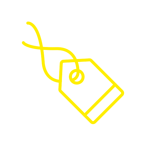


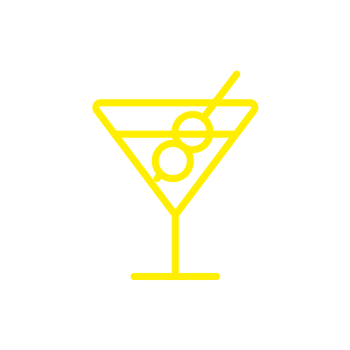

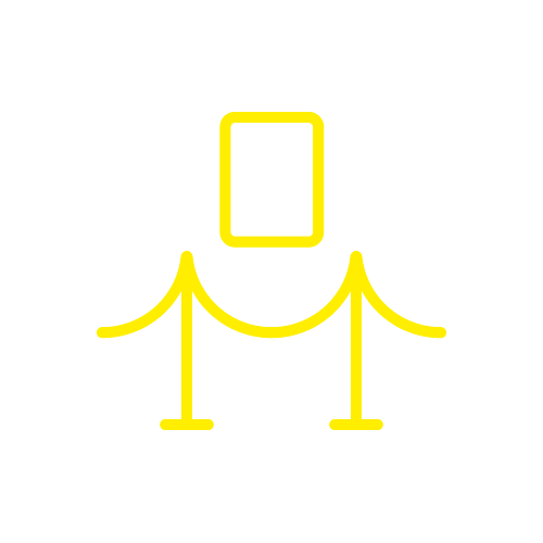

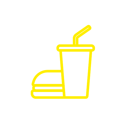

The dotted pattern represent the masses. The one yellow dot in the logo symbolises independency.


